Below is a step by step introduction to the bs4Dash structure.
Create a basic page
This is the template to start with bs4Dash:
library(shiny)
library(bs4Dash)

shinyApp(
  ui = dashboardPage(
    title = "Basic Dashboard",
    header = dashboardHeader(),
    sidebar = dashboardSidebar(),
    controlbar = dashboardControlbar(),
    footer = dashboardFooter(),
    body = dashboardBody()
  ),
  server = function(input, output) {}
)
Basic page template
The dashboardPage() is the main wrapper:
dashboardPage(
  header,
  sidebar,
  body,
  controlbar = NULL,
  footer = NULL,
  title = NULL,
  freshTheme = NULL,
  preloader = NULL,
  options = NULL,
  fullscreen = FALSE,
  help = FALSE,
  dark = FALSE,
  scrollToTop = FALSE
)
has mandatory slots for the navbar (dashboardHeader()),
sidebar (dashboardSidebar()) and
(dashboardBody()). Note the
dashboardControlbar() and dashboardFooter()
are optional. The title parameter gives its name to the
web browser tab. freshTheme, when provided, expects a
fresh powered theme
created with fresh::create_theme(). It allows deeper
customization of colors to fit very specific needs like industry brand
colors. preloader expects a loader tag built with
waiter, see more here, for instance:
At the moment, options are not available, but the idea is to provide deeper customization of the AdminLTE3 template like changing the sidebars and cards animation speed, …
When fullscreen is TRUE, an icon is displayed in the
navbar to switch to full screen mode. help
automatically enable/disable all tooltips and popover that are present
in the shiny app: this is an easier approach than using the server
methods addPopover(), addTooltip(), … but less
specific. dark allows to toggle the dark mode: if
FALSE, the theme switch is hidden and the dashboard takes the light
design. scrollToTop allows to toggle the scroll to top
button shown in the bottom right corner.
Now, it is time to fill this template!
Sidebar Setup
Below we quickly describe the dashboardSidebar()
function:
dashboardSidebar(
  disable = FALSE,
  width = NULL,
  skin = "dark",
  status = "primary",
  elevation = 4,
  collapsed = FALSE,
  minified = TRUE,
  expandOnHover = TRUE,
  fixed = TRUE,
  id = "sidebar",
  customArea = NULL,
  ...
)
A lot of options are available:
- disable to disable the sidebar.
- width controls the sidebar width.
- Two skins, namely “light” or “dark”.
- elevation is a number between 0 and 5, which applies a shadow to the sidebar to add a shadow effect.
- The sidebar status determins which color
menuItem()have. There are 20 different colors listed ingetAdminLTEColors(). - collapsed , if TRUE the sidebar is collapsed at start.
- minified, if TRUE the sidebar is minified at start. What is the difference between collapse and minified? Minified means a little part of the sidebar is still visible.
- expandOnHover, when minified is TRUE, if this property is TRUE, the sidebar opens when hovering but re-collapses as soon as the focus is lost.
- fixed, if TRUE, the sidebar has a vertical overflow, which allows to see all menus at once without scrolling up and down.
-
id is used by the
updateSidebar()function to programmatically toggle the sidebar on the server.input$<id>indicates the state of the sidebar: TRUE means open and FALSE means collapsed/minified. - customArea is an area at the bottom of the sidebar to contain elements like buttons.
The skin switch feature allows to automatically toggle the sidebar skin.
Importantly, the sidebar contains sidebarMenu() as well
as other items like sidebarUserPanel(),
sidebarHeader():
sidebarUserPanel(
    image = "https://image.flaticon.com/icons/svg/1149/1149168.svg",
    name = "Welcome Onboard!"
)

sidebarMenu(
  id = "sidebarmenu",
  sidebarHeader("Header 1"),
  menuItem(
    "Item 1",
    tabName = "item1",
    icon = icon("sliders")
  ),
  menuItem(
    "Item 2",
    tabName = "item2",
    icon = icon("id-card")
  )
)
sidebarMenu() drives the navigation within your
dashboard. It has an id parameter which allows to :
- Get the name of the currently selected tab, with
input$<id>. - Update the currently selected tab with
updateTabItems(), which is actuallyshiny::updateTabsetPanel.
sidebarMenu() also offers 4 cosmetic parameters:
- flat is a style parameter like in material design.
- compact makes the sidebar content smaller.
- childIndent shows an indentation between the parent item and nested subitems.
- legacy allows to use the old AdminLTE2 style.
Interestingly, menuItem() can be more than a simple item
and contain sub-items, namely menuSubItem():
menuItem(
    text = "Item List 1",
    icon = icon("bars"),
    startExpanded = TRUE,
    menuSubItem(
        text = "Item 3",
        tabName = "tab3",
        icon = icon("circle-thin")
    ),
    menuSubItem(
        text = "Item 4",
        tabName = "tab4",
        icon = icon("circle-thin")
    )
)
startExpanded defines whether the item container has
to be opened when the app starts. When a menuItem()
contains nested items, it is not necessary to give it a
tabName. text may also contain more
complex HTML tags like dashboardBadge(). If you want to use
menuItem() to browse to an external website, use the
href parameter as well as newTab to
open a new web browser tab.
Like in shinydashboard,
input$sidebarItemExpanded hosts the value of the currently
expanded sidebarItem.
Navbar Setup
The dashboardHeader() function creates a navbar for
bs4Dash:
dashboardHeader(
  title = NULL,
  titleWidth = NULL,
  disable = FALSE,
  .list = NULL,
  skin = "light",
  status = "white",
  border = TRUE,
  compact = FALSE,
  sidebarIcon = shiny::icon("bars"),
  controlbarIcon = shiny::icon("th"),
  fixed = FALSE,
  leftUi = NULL,
  rightUi = NULL
)
The title parameter can host simple text but more
complex content like dashboardBrand():
title <- dashboardBrand(
    title = "My dashboard",
    color = "primary",
    href = "https://adminlte.io/themes/v3",
    image = "https://adminlte.io/themes/v3/dist/img/AdminLTELogo.png"
)
dashboardBrand() is an enhanced title which has a color
status, points to an optional url and may contain a logo. The title
width can be controlled by titleWidth, like in
shinydashboard. Like dashboardSidebar(),
dashboardHeader() offers a lot of theming options with
skin and status, but also with
border and compact. They respectively
show a bottom border and smaller text. sidebarIcon and
controlbarIcon control icons for sidebar and
controlbar, respectively. The fixed parameter is useful
when one wants to see the navbar even at the bottom of the dashboard,
without having to scroll up.
leftUi, ... and rightUi are
containers that can contains content from left to right. Ideally, we put
dropdownMenu() as well as taskItem(),
messageItem(), notificationItem(),
dashboardUser()…
Right Sidebar Setup
dashboardControlbar() provides an extra sidebar, on the
right side:
dashboardControlbar(
    id = NULL,
    disable = FALSE,
    width = 250,
    collapsed = TRUE,
    overlay = TRUE,
    skin = "dark",
    pinned = NULL
)
Like the dashboardSidebar(),
dashboardControlbar() may be programmatically toggled on
the server with updateControlbar(), provided that the
id parameter has a value. In practice, if no id is
passed by the user, bs4Dash assigns a specific id. One
can control the dashboardControlbar() state at start with
collapsed. If TRUE, the controlbar is collapsed and
inversely. By default, overlay is TRUE, meaning that
the controlbar opens on top of the body content. If FALSE, it pushes and
the body content to the left. pinned allows the
controlbar to remain open even after a click outside (clicking outside
collapses the controlbar by default). This is useful to keep focus on
important options whenever necessary. Finally, the controlbar is
entirely themable, like dashboardSidebar() and
dashboardHeader().
dashboardControlbar() contains
controlbarMenu() that hosts controlbarItem().
This feature is built on top the shiny::tabsetPanel, that
has been rebranded for Bootstrap 4 compatibility:
controlbarMenu(
    ...,
    id = NULL,
    selected = NULL,
    type = c("tabs", "pills"),
    position = NULL,
    vertical = FALSE,
    side = "left",
    .list = NULL
)
controlbarMenu() may be updated on the server with
updateControlbarMenu() (which is no more than
shiny::updateTabsetPanel). If you want to have a simple
container without menu, you will have to add a specific class to account
for padding, as shown below:
dashboardControlbar(
    div(
        class = "p-3",
        # any content
    )
)
Footer Setup
We will use dashboardFooter():
dashboardFooter(
  left = a(
    href = "https://twitter.com/divadnojnarg",
    target = "_blank", "@DivadNojnarg"
  ),
  right = "2020"
)
Nothing special to add here!
Setting up the body content
dashboardBody() is the main dashboard container:
dashboardBody(
  tabItems(
    tabItem(
      tabName = "item1",
      fluidRow(
        lapply(1:3, FUN = function(i) {
          sortable(
            width = 4,
            p(class = "text-center", paste("Column", i)),
            lapply(1:2, FUN = function(j) {
              box(
                title = paste0("I am the ", j, "-th card of the ", i, "-th column"),
                width = 12,
                "Click on my header"
              )
            })
          )
        })
      )
    ),
    tabItem(
      tabName = "item2",
      box(
        title = "Card with messages",
        width = 9,
        userMessages(
          width = 12,
          status = "success",
          userMessage(
            author = "Alexander Pierce",
            date = "20 Jan 2:00 pm",
            image = "https://adminlte.io/themes/AdminLTE/dist/img/user1-128x128.jpg",
            type = "received",
            "Is this template really for free? That's unbelievable!"
          ),
          userMessage(
            author = "Dana Pierce",
            date = "21 Jan 4:00 pm",
            image = "https://adminlte.io/themes/AdminLTE/dist/img/user5-128x128.jpg",
            type = "sent",
            "Indeed, that's unbelievable!"
          )
        )
      )
    )
  )
)
The principle is pretty straightforward: all
dashboardBody() elements must be embeded in a
tabItems() list containing as may elements as the number of
items. Each item is a tabItem(). Importantly, the
tabName argument must be provide and unique. Moreover,
it must be identical to the corresponding menuItem(), so
that the navigation between tabs work. This is exactly the same
principle as for shinydashboard. Therefore, users should
not be lost.
In practice, if the sidebar is empty (without menu), it is still
possible to get rid of tabItems() and
tabItem().
Wrap Up
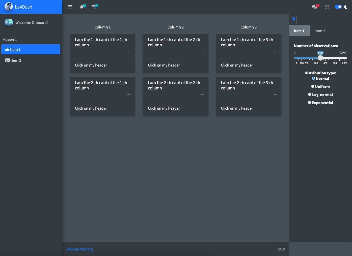
Below is the code for your first bs4Dash application:
Code
shinyApp(
ui = dashboardPage(
title = "Basic Dashboard",
fullscreen = TRUE,
header = dashboardHeader(
title = dashboardBrand(
title = "bs4Dash",
color = "primary",
href = "https://www.google.fr",
image = "https://adminlte.io/themes/AdminLTE/dist/img/user2-160x160.jpg",
),
skin = "light",
status = "white",
border = TRUE,
sidebarIcon = icon("bars"),
controlbarIcon = icon("th"),
fixed = FALSE,
leftUi = tagList(
dropdownMenu(
badgeStatus = "info",
type = "notifications",
notificationItem(
inputId = "triggerAction2",
text = "Error!",
status = "danger"
)
),
dropdownMenu(
badgeStatus = "info",
type = "tasks",
taskItem(
inputId = "triggerAction3",
text = "My progress",
color = "orange",
value = 10
)
)
),
rightUi = dropdownMenu(
badgeStatus = "danger",
type = "messages",
messageItem(
inputId = "triggerAction1",
message = "message 1",
from = "Divad Nojnarg",
image = "https://adminlte.io/themes/v3/dist/img/user3-128x128.jpg",
time = "today",
color = "lime"
)
)
),
sidebar = dashboardSidebar(
skin = "light",
status = "primary",
elevation = 3,
sidebarUserPanel(
image = "https://image.flaticon.com/icons/svg/1149/1149168.svg",
name = "Welcome Onboard!"
),
sidebarMenu(
sidebarHeader("Header 1"),
menuItem(
"Item 1",
tabName = "item1",
icon = icon("sliders")
),
menuItem(
"Item 2",
tabName = "item2",
icon = icon("id-card")
)
)
),
controlbar = dashboardControlbar(
skin = "light",
pinned = TRUE,
collapsed = FALSE,
overlay = FALSE,
controlbarMenu(
id = "controlbarmenu",
controlbarItem(
title = "Item 1",
sliderInput(
inputId = "obs",
label = "Number of observations:",
min = 0,
max = 1000,
value = 500
),
column(
width = 12,
align = "center",
radioButtons(
inputId = "dist",
label = "Distribution type:",
c(
"Normal" = "norm",
"Uniform" = "unif",
"Log-normal" = "lnorm",
"Exponential" = "exp"
)
)
)
),
controlbarItem(
"Item 2",
"Simple text"
)
)
),
footer = dashboardFooter(
left = a(
href = "https://twitter.com/divadnojnarg",
target = "_blank", "@DivadNojnarg"
),
right = "2018"
),
body = dashboardBody(
tabItems(
tabItem(
tabName = "item1",
fluidRow(
lapply(1:3, FUN = function(i) {
sortable(
width = 4,
p(class = "text-center", paste("Column", i)),
lapply(1:2, FUN = function(j) {
box(
title = paste0("I am the ", j, "-th card of the ", i, "-th column"),
width = 12,
"Click on my header"
)
})
)
})
)
),
tabItem(
tabName = "item2",
box(
title = "Card with messages",
width = 9,
userMessages(
width = 12,
status = "success",
userMessage(
author = "Alexander Pierce",
date = "20 Jan 2:00 pm",
image = "https://adminlte.io/themes/AdminLTE/dist/img/user1-128x128.jpg",
type = "received",
"Is this template really for free? That's unbelievable!"
),
userMessage(
author = "Dana Pierce",
date = "21 Jan 4:00 pm",
image = "https://adminlte.io/themes/AdminLTE/dist/img/user5-128x128.jpg",
type = "sent",
"Indeed, that's unbelievable!"
)
)
)
)
)
)
),
server = function(input, output) {}
)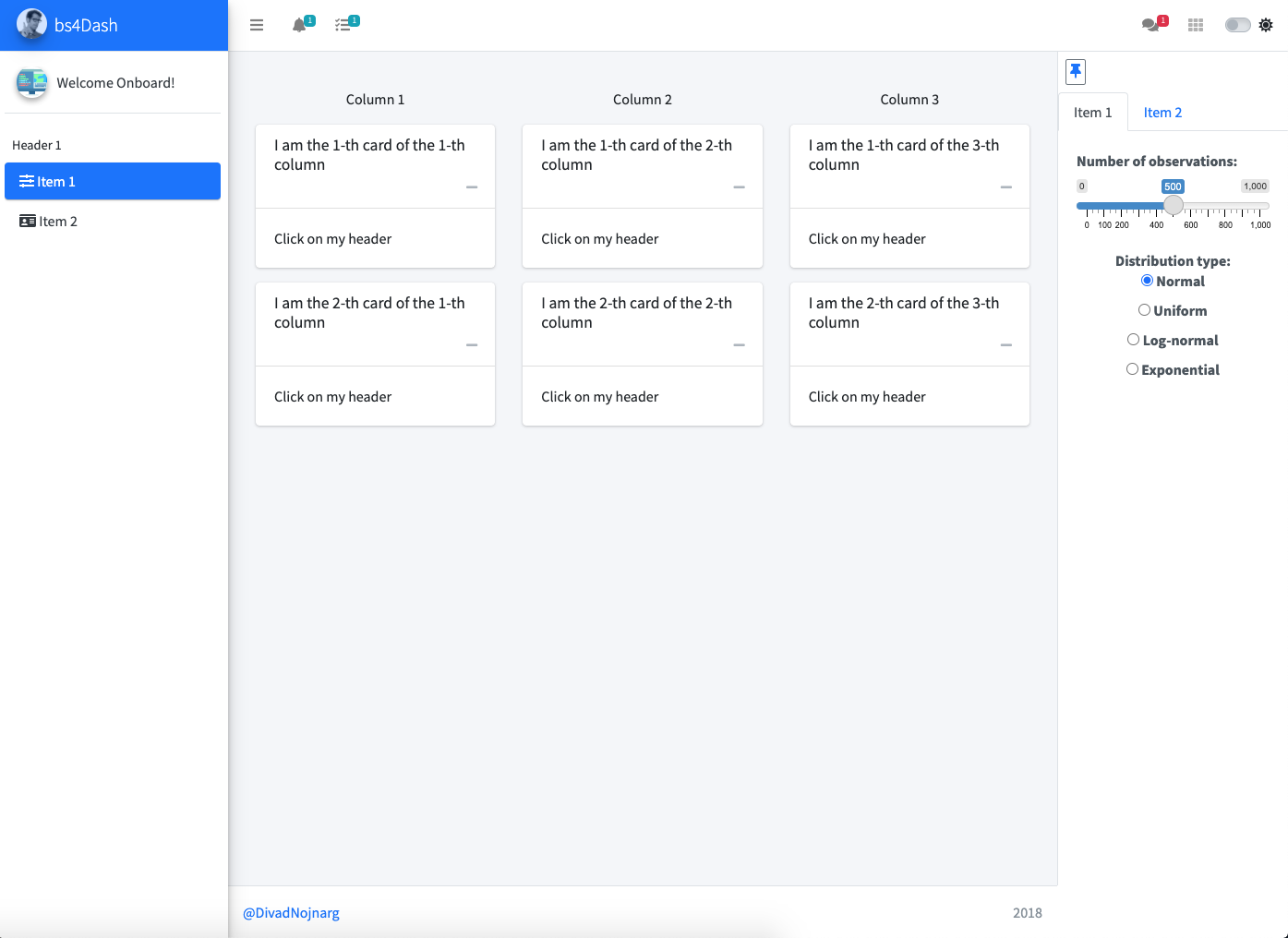 Light
Light
 Dark
Dark
* All credits go to https://codyhouse.co/gem/css-jquery-image-comparison-slider/ for the nice image slider widget!
Advanced shiny user would probably design shiny modules to generate this page, which I really encourage. However, how to deal with modules is not the purpose of this article.